Internship Timeline
Jan - July 2017 (full-time)
My Role
Product Manager Intern
Team
LinkedIn China Team - Content Pillar
(Report to team in Beijing & Mountain View, CA)
Projects Shipped & Daily Works
1. LinkedIn Article Mobile Web Experience Redesign
(this project)
2. Bing (Microsoft) & Zaker News API Integration
3. Data Analysis for China Content product performance
4. Chitu App Product Design
Pitch, Got Challenged, Repeat!
Pitching and presenting the product ideas with my team to Product VP from HQ, Head of Marketing from LinkedIn China, etc.
Product Ownership & Impact
As the PM, we shipped this feature after going through the development compliance process, now ramped to all LinkedIn China users!
Project Background
LinkedIn Article Mobile Web Experience Redesign is one of the projects I shipped with China Content Team in my 6 mons PM Internship back in 2017.
We redesigned, developed and shipped to 40M+ LinkedIn China users the mobile web experience, which is the experience when they are reading an LinkedIn article on other social platforms shared from the LinkedIn native app.
Discover the Problem through Data
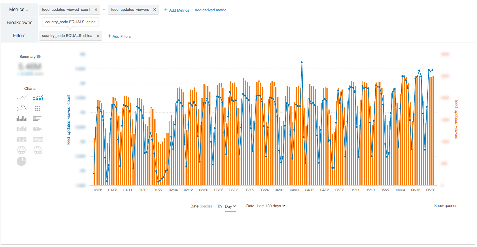
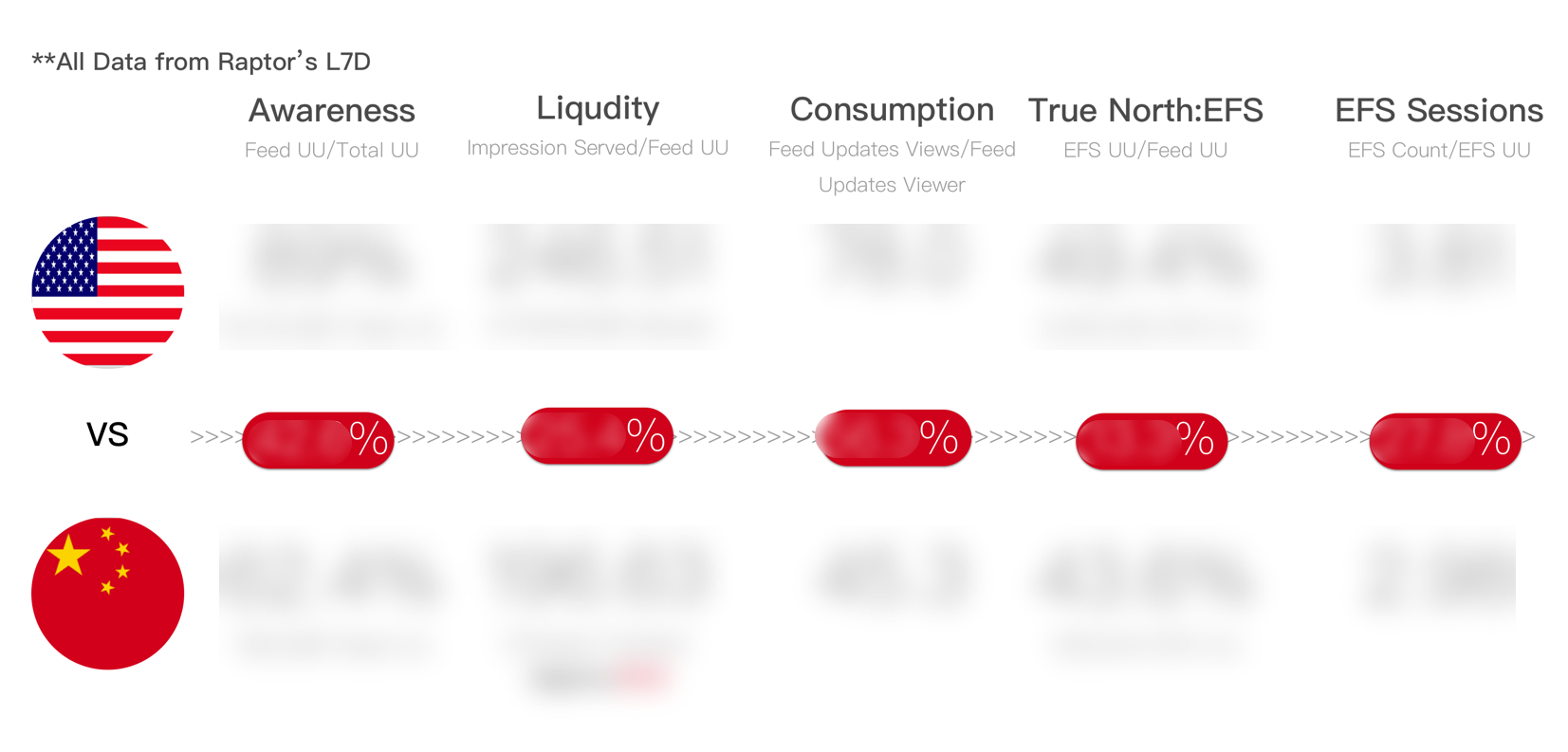
As a PM intern, one important daily task for me is to view and analysis the China Content team's Product Performance Dashboard. I found the CTR (Click-through rate) from the LinkedIn article on the mobile web is around the same comparing to the native app and the desktop.
However, I see this number should be way more than the desktop and native app because of the huge user base - WeChat. From our Data Scientist in the team, I know that by then the mobile web experience on LinkedIn was mainly through the hugest eco-system in China - WeChat.
Growth Opportunities
Chinese customers tend to spend a lot of time on commute each day, and because of that, the need for consuming quality content is huge.
In March / April 2017, there were around 32 M users registered on LinkedIn China app. And around 1 B users on WeChat. From here, my team and I see the huge potential for user growth and optimization.
The Problem
What caused the low CTR and EFS (Engagement) was LinkedIn's security / privacy structure: the log-in wall upon opening an link from the native app. When users open the link in WeChat shared by their friends, their expectation would be seeing the content in seconds, instead of going through the long log-in/sign-up process.
However, even if we managed to log in, the mobile web experience was still minimum. While scrolling through the page, there were very few user growth CTAs, and the loading speed, as well as responsive design layout, can be optimized as well.
THE SHARED CONTENT WAS BLOCKED BY THE LOG-IN WALL
Redesign the Experience: A Cross-team Collaboration
As a PM intern, 50% of my time was devoted to communication with different teams to land a feature. Being a designer for my past two jobs, I didn’t have much chance to collaborate with teams like Marketing, Data Scientist and Business development team. But this time as a PM intern at LinkedIn, this redesign project drove me to have conversations with so many different teams and people, to gather insights and tackle the engineering obstacles we have.
Finally, we “deconstructed” the problems into small actionable tasks, planned and pulled them up from backlog to our sprint board! As a PM, my duties included deciding and prioritizing the feature with both backend and frontend tech leads every sprint. As well as set up product metrics KPIs and with Data Scientist team, to make sure we're approaching the correct direction and can measure the product’s success.
The Solution
From the customer pain point and the directions of optimization in mind, we set the redesign goals and product objectives to be:
(1) Spread LinkedIn's Brand & CTA for User Growth
The mobile web experience need to clearly involved with LinkedIn's brand. Also implement multiple entry points to transform readers into LinkedIn Users. All the CTAs will be guiding the traffic to download or open the LinkedIn native app - where we can provide users with a better and more complete experience on the mobile web.
(2) Engage Readers with Authors' Professional Identity
We also collaborate closely with other pillars like Career and Profile team, from here we can integrated with the LinkedIn Name Card redesign for WeChat, using the author’s professional identity to spread and maximize the value of the content.
Product Design Mindset In PM's Practice
As a product manager, I work closely with designers to initialize the user experience for new features. LinkedIn conducted several User Experience Research(there was a dedicated UER team from Mountain View, CA) workshops while my internship, it was pretty helpful for me to attend those actual UER sessions to dig out user needs.
Then, I demonstrate the product goals and pitch the new features to tech leads via design click-throughs and design mockups. Engineers are usually quite challenging to talk to since they have practical insights and usually think through technical ways, which is vital for product managers to think through why to develop a new feature.
Show Author's Identity
To show the author’s professional identity and enlarge the influence of the article, in the product design, we added a section - “written by”.
In this section, the user can see the professional title of the author, as well as exploring his/her other publications on LinkedIn. This idea also referenced a lot of other text-heavy and content marketing products, like Medium, Flipboard and several other products in China mainland like 简书, 知乎, 轻芒阅读.
Add Channel and Entry Point for Top Articles
From the LinkedIn China native app, there was no “top article” or “daily digest” section as an entry point for the user to discover high-quality content.
In the mobile web experience, we asked the editorial team to pick and use the mobile web as a supplementary entry point.
This feature was later optimized using algorithms to calculate 3 other articles that are similar to the one user is currently reading, to create a “rabbit hole” experience.
Collapse the Long Content & Improve Discoverability
In the article text section, we collapsed the content if the height of the text > 1.5 screen height, to increase the of other features.
Ship It!
As a global corporation, LinkedIn has a pretty complex compliance process and code base dependency. Our team designed a new API and optimized the loading speed for articles’ mobile web experience, to provide users with the smoother reading experience.
After rounds of A/B testing, this redesign is now 100% ramped to all LinkedIn China users!
See the differences between the two here!Before
🌟after🌟
Key Takeaways
I was truly honoured to work with those global top-tired folks! On my last day at LinkedIn, my mentor threw me a farewell party🍰
Working on something you are not familiar with is never easy. PM job was quite challenging for me since I'm from a design background. But the training and studying through half of the year has strengthened my ability to analyze data quantitatively and logically.
Being a PM at LinkedIn also improved a lot on my soft skills like public speaking. I was under a lot of pressure for the first few times when I have to give a presentation via video or actual meeting which lots of high-hierarchy managers would attend, to pitch the new product idea. Luckily, through these presentations, I could manage my ideas and expressions much more clear and logical than before💪
